Corporate Headshot Photography & Creativity
When one conjures the idea of a headshot, their first idea might be of a traditional man or woman in a suit in front of a backdrop. My image is of a guy in a brown suit against a mottled tan background – some 70's version.
Thankfully, this kind of photography has come a very long way. Professionals want to look modern and fashion-forward. Scroll through LinkedIn and you will see that this old time-y idea is no longer the norm at all. As New York business photographers, we love to see the plethora of new ideas that have come to be valid and legitimate options for corporate headshot photography.
As far as creative direction is concerned, we have two types of clients: 1) Clients that prefer a clean and conservative, but updated, image and 2) Clients that want “something different”.
Most clients that come to us are looking for an update to their current look, whether it's a clean and traditional feel or something completely distinctive and creative. Company culture has shifted, styles are new and workplaces are different, whether in New York, Philadelphia, or Washington DC. Company culture and style needs to be signaled in their new corporate headshot look.
Clients usually come to us during the following times in their visual branding cycles:
In the midst of a complete rebranding. They are updating EVERYTHING, from website to print materials to logo. They want a new look and want professional headshot photos of their team to reflect that.
Need updated visuals. Everyone's a little older and the company wants to visually signal that they are updating and staying current with the times. They want a fresh new headshot look.
Once a company knows they would like to make this visual change, they have to make the difficult decisions on how they want their staff to be represented. If you’re rebranding completely, the sky's the limit. Working alone or together with a branding or design professional, the company has many options and can work through how different choices will work inside of their brand. By the time they come to decisions around professional headshot photography and executive portraits, the company will have some guidelines in place. We are glad to take part in those final collaborations and bring those decisions home.
Clients in category 2 have many of the decisions from category 1 in place. They are likely looking for continuity of their existing brand. They want something updated, but not completely different.
Check out our blog post about branding and corporate headshot photography here.
Breaking Down The Creative Process
Categorizing creative options can help put structure to what can feel like an unwieldy decision. Start with the below ideas:
Solid or Environmental Background
One of the biggest decisions companies make about their business headshots is whether they use a solid background (using a backdrop) or environmental background (using the office or location).
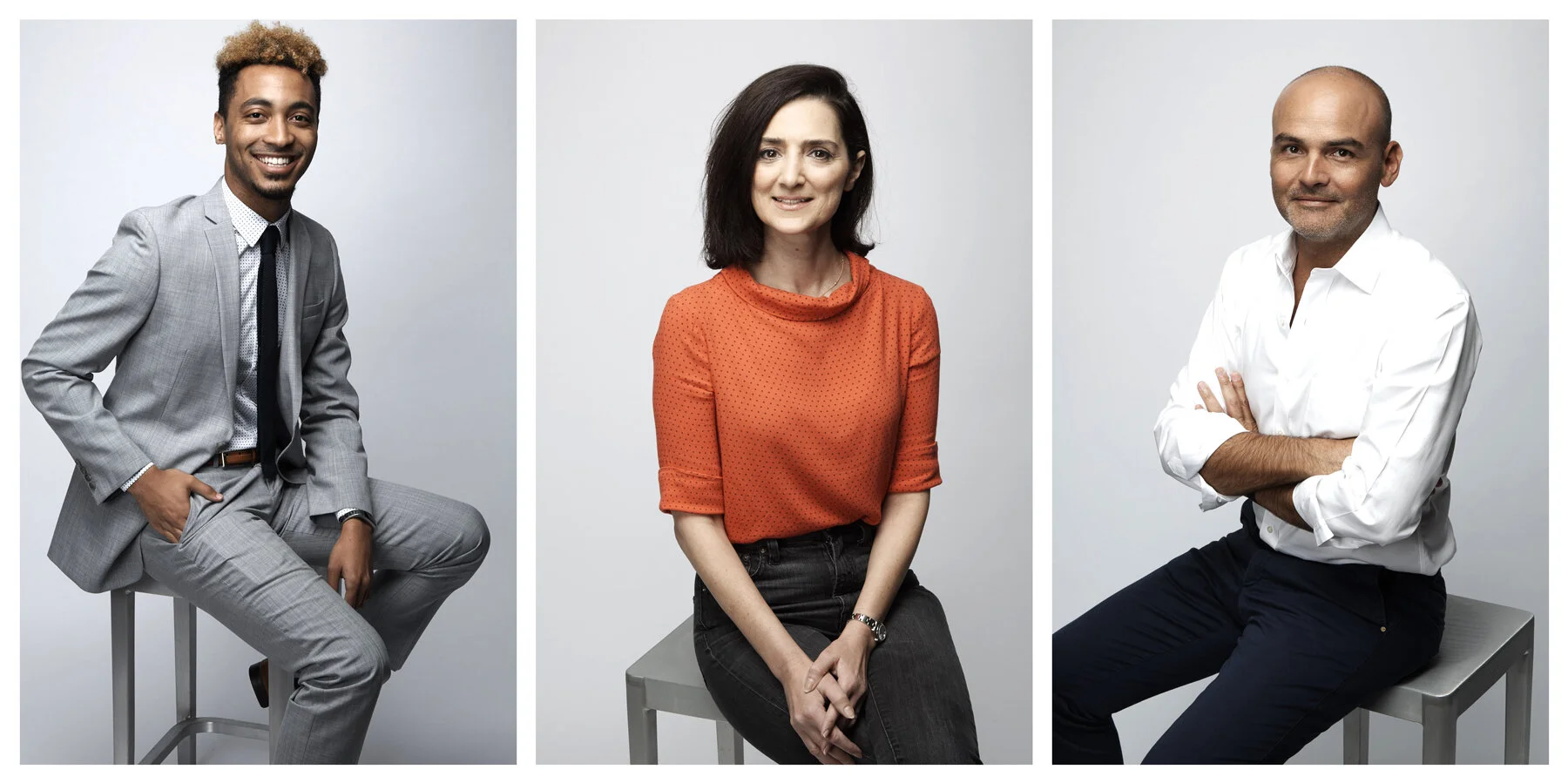
A solid background is a clean and consistent option. It works well for large organizations that need their business headshot photos to be consistent and dependable. For example, a company with 100+ employees might have specific brand guidelines. This helps them to establish consistency across look and specific size requirements. Perhaps they do not need just a New York executive headshot photographer. They need to cover people in multiple locations. They also want to make sure new hires will all have the same look in their photos. They might need to consider how to maintain this consistency in offices in more than one location. The easiest and most obvious way to do this is to pick a specific background color that can be sourced easily and adopted over space and time.
On the other hand, environmental photography offers an opportunity to showcase a beautiful office space, an impressive library, or a significant graphic element. Using interiors and other design elements around your office is an opportunity to share something about the character, direction and professionalism of your company.
While there have been trends towards environmental photography, there are some challenges. The first challenge to overcome is whether you have a photography-appropriate space. Consider whether the background is going to look good and/or really illustrates something important about your company. Other things to think about: Is it big enough to set up studio lights or is the space bright enough for natural light? Is it a high traffic area that people need to access throughout the day and therefore disrupt the shoot?
The other challenge is creating consistency across locations with an environmental headshot. If your people are across town, you can arrange to have them visit one location for headshots. If they are in different cities, you would need a separate solution. In this case you might consider environmental headshots with a consistent look and feel, but that is deliberately different. Pick 3 locations so you maintain consistency on your website, but nothing stands out as different. You can also consider retouching as a means to create consistency. If you want the same environmental background but have multiple offices in multiple cities, consider shooting the headshots on a solid background and superimposing the business portraits onto an environmental background image or what we call a ‘plate’.
For example, if you’re a New York company but you have offices in Washington DC or Philadelphia, instead of looking for a different Washington DC corporate headshot photographer or a different Philadelphia corporate headshot photographer, you can have one team shoot against the same solid background and edit in the exact background plate from New York. This is a quick and simple solution to a multifaceted situation!
Color vs Black & White
The vast majority of our clients opt for color photos. It is by far the standard for corporate headshot photography for all the obvious reasons. Color adds a vibrancy and can be used to connect to other branding elements for a business.
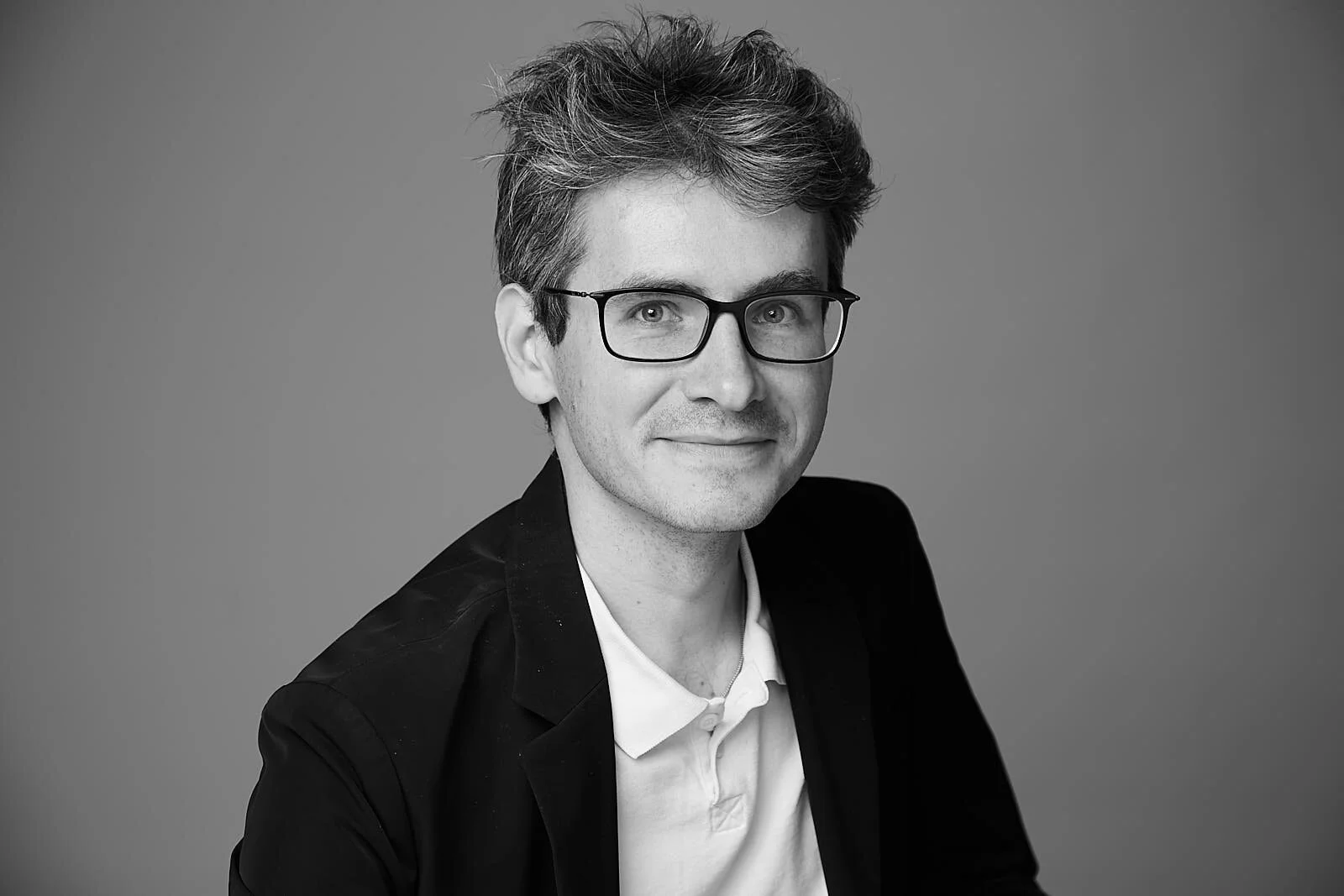
On the flip side, we do use black and white corporate photography to excellent results for our clients who are seeking an editorial or documentary feel. When shooting in black and white you are relying on contrast, tone, shadow, shape and texture to tell your story. It allows for a more minimalistic design for companies or groups wanting something elegant but not too busy. We have been able to balance those characteristics to great effect for design firms, educational institutions and advertising agencies.
Quality of Light
Quality of light is defined as how hard or soft the light is in your photos. Here are a couple of examples to illustrate this.
The example on the left is a very soft light. It can be achieved by very large light sources close to the subject. On the right is a harder light, achieved by a more focused light source. A wide open soft light tends to be very flattering amongst ages and skin tones. While we don't tend to go super hard on our light, we do sometimes push towards a harder light to create more dimension and drama in a professional headshot. It all depends on the creative direction for the executive portraits.
Crop
Most business headshots are slightly angled, but centered, shoulders up, vertically cropped. Again, if 'consistent' and 'traditional' are the names of your game, this is perfect. Should you want something a little different, try an off-center crop. Done with purpose, it can add an unique element.
There are a few ways to switch up your crop. You can stick with that vertical shoulder's up standard framing, but turn people a little more in the frame and fill up different, more extreme quadrants. Another look is to switch to a horizontal orientation and push your subject all the way to the right or left.
Case Studies:
Solid background. Very basic but very beautiful. You cannot go wrong with a warm grey background. It is neutral and everyone looks good against it. Colors pop off of this background color. They will not clash.
Colorful background. This is a photograph that we did for Culture.... Bumblebiz was focusing on millennial female professionals who were attending a career development conference. They wanted a New York corporate headshot photographer that could achieve a forward-minded New York business portrait look against pink. These were the fabulous results.
Law Firm. While some law firms choose a more conservative look, this firm expertly combined a professional look with a sense of approachability. They chose a soft, open, almost natural-light look against an office background. Notice that they were focused on the suggestion of a professional surroundings. They played with depth of field so that it didn't feel too specific.
Tech Professional. This is an executive portrait we did for Forbes Magazine. They wanted an environmental portrait that was a straightforward illustration of what the subject did. The whiteboard behind him was full of formulas and it became clear that this would be a perfect background. Note that the quality of light was very different for this portrait than from the law firm portrait above. Both are signaling professionalism, but this is a harder, more focused light.
Black & White + Crop. In the example below, we see two design elements at play. We were covering a forward-thinking group at a conference in NYC. We knew we would have media and beauty industry attendees coming for a headshot and thought they would be open to something less traditional. We went with a more editorial black and white look, still soft and open light. We also changed up the crop for each subject. This is an example where every subject is cropped slightly differently, but the overall look pulls together and could be used on the same webpage.
These are great places to start when deciding on the creative direction for your new company corporate headshots. Once you find what works for your company you can fine tune your decisions and create photos that are perfect for your brand.


